





Matte vs Glossy Photos in 2026: How to Pick the Right Print Finish for Your Catalog
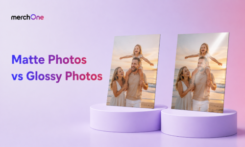
For print-on-demand sellers and photographers, neither finish is automatically better. The right choice depends on the subject, the room, and the buyer’s use case. Portraits, fine art, black-and-white work, and bright rooms usually favor matte. Landscapes, sunsets, vivid digital art, and commercial product photography often favor glossy.
The best wall art catalogs usually offer both finishes instead of forcing one default across every image. Matte gives buyers viewing flexibility. Glossy gives buyers color impact. Luster or satin can work as the middle option when the decision is not obvious.
Key Takeaways
- Matte and glossy are not quality tiers: they are optical choices for different subjects and display environments.
- Glossy paper: creates stronger color saturation and contrast because the smooth coating reflects light cleanly.
- Matte paper: creates softer tones and zero glare because the textured coating scatters light.
- Best for matte: portraits, black-and-white photography, fine art prints, vintage aesthetics, and brightly lit rooms.
- Best for glossy: landscapes, sunsets, vibrant digital art, product photography, and gallery-style controlled lighting.
- Luster, satin, or pearl: sits between matte and glossy and works well when buyers want color without heavy glare.
- POD catalog strategy: offering both finish options on the same image can lift buyer confidence and support higher AOV.
Quick Answer Table: Matte vs Glossy Photos
The simplest way to choose between matte and glossy is to match finish to subject and room. A strong print can still disappoint if the finish fights the lighting or the image style.
| Factor | Matte | Glossy | Seller takeaway |
|---|---|---|---|
| Color saturation | Softer and more muted | High saturation and punchy contrast | Use glossy when color impact drives the sale |
| Glare | No glare | Can show glare under direct light | Use matte for bright residential rooms |
| Fingerprints | Conceals fingerprints better | Shows fingerprints more easily | Matte is better for handled prints |
| Best subject | Portraits, B&W, fine art, vintage | Landscapes, sunsets, vivid digital art | Subject matter usually settles the decision first |
| Room fit | Bright rooms, mixed lighting, hallways | Gallery lighting, controlled rooms | Match finish to lighting conditions |
The Optics Behind Each Finish
The visual difference starts with the coating. Glossy paper has a smooth, sealed surface that creates specular reflection. Light reflects back toward the viewer in a more direct path, which makes colors look punchier and shadows look deeper. The trade-off is glare when the print sits near windows, lamps, or bright overhead lighting.
Matte paper has a textured surface that creates diffuse reflection. Instead of reflecting light back in one clean direction, it scatters light through many micro-angles. That removes glare and keeps the image visible from more positions in the room, but it also softens saturation and contrast.
Luster, satin, or pearl finishes sit between the two. They carry more color punch than matte but less glare than full gloss. Many portrait photographers use luster as a default because it balances color, skin tones, and viewing flexibility.
Where Matte Paper Fits
Matte photo paper is the right specification when the image rewards subtlety, needs glare-free viewing, or will hang in a brightly lit room. It gives prints a softer, more understated finish that feels natural in residential spaces.
- Portrait photography: matte softens highlights and helps skin tones look more natural.
- Black-and-white photography: tonal transitions and midtones read more smoothly without glossy overcontrast.
- Fine art prints: paintings, illustrations, watercolors, and graphite work feel more authentic on matte textures.
- Vintage and moody aesthetics: cottagecore, dark academia, film-style photography, and folk artwork benefit from matte softness.
- Brightly lit rooms: kitchens, living rooms, sunrooms, and commercial spaces often need glare control more than color punch.
Matte also tends to age more gracefully on prints that may be handled, moved, or re-framed, because the textured surface hides minor fingerprints and small surface marks better than glossy paper.
Where Glossy Paper Fits
Glossy photo paper is the right specification when the image depends on color punch, contrast, or a polished commercial look. It works best when lighting can be controlled or when the print will be viewed straight-on.
- Landscape photography: sunsets, coastlines, mountains, and aerial scenes gain drama from glossy saturation.
- Product and food photography: glossy finishes support a polished, editorial look.
- Vivid digital art: neon illustrations, modern abstracts, and pop art can use the full color range.
- Gallery and exhibition contexts: controlled lighting can minimize glare while preserving color impact.
- Marketing and portfolio materials: glossy reads as professionally produced at a glance.
Glossy can also feel more premium to buyers who associate shine with classic photo prints. The risk is that the same shine can become distracting if the print hangs in a bright room with uncontrolled reflections.
Side-by-Side Comparison: 8 Practical Criteria
Sellers should compare finishes across the factors buyers actually notice: color, glare, viewing angle, handling, subject matter, room environment, perceived quality, and cost.
| Criterion | Matte | Glossy |
|---|---|---|
| Color saturation | Softer, muted, painterly | High saturation, punchy contrast |
| Glare under lighting | None | Significant under direct light |
| Viewing angles | Consistent from most positions | Best straight-on |
| Fingerprint visibility | Conceals well | Shows clearly |
| Subject fit | Portraits, fine art, B&W, moody aesthetics | Landscapes, vivid color, commercial images |
| Room environment | Bright rooms and mixed lighting | Gallery-style controlled lighting |
| Perceived quality | Refined, gallery, fine art | Polished, commercial, shiny premium |
| Production cost | Usually similar to glossy at comparable paper weight | Usually similar to matte at comparable paper weight |
How Professional Photographers Choose
Working photographers rarely choose based on personal preference alone. They start with the subject, then the display environment, then the buyer’s use case.
Skin tones and fine art usually push toward matte or luster. Landscapes and vivid color often push toward glossy or luster. Bright kitchens, sunlit living rooms, stairwells, and mixed-light spaces push toward matte. Galleries, controlled hallways, and professional display spaces can support glossy more easily.
Handling also matters. Albums, proof prints, and portfolio books often favor matte because fingerprints are less visible. Framed-and-mounted prints can go either way because the finish is protected behind glass or acrylic mounting.
Matte vs Glossy by Subject Matter
Subject matter often settles the finish decision faster than personal taste. The categories that favor glossy usually depend on color saturation. The categories that favor matte usually depend on tonal subtlety, skin rendering, or paper-like authenticity.
| Subject category | Recommended finish | Reason |
|---|---|---|
| Wedding portraits | Matte or luster | Skin tone rendering, handling, album use |
| Family and child portraits | Matte or luster | Glare-free viewing and fingerprint resistance |
| Black-and-white fine art | Matte | Tonal subtlety and gallery aesthetic |
| Landscape and nature | Glossy or luster | Color saturation and atmospheric depth |
| Sunsets and dramatic skies | Glossy | Maximum color punch |
| Watercolor and illustration | Matte | Substrate authenticity |
| Product photography | Glossy | Commercial polish |
Display Environment Matters as Much as Subject
A great glossy landscape can become a glare problem in a bright kitchen. A matte portrait can look beautiful in a living room but slightly muted in a controlled gallery setting. Room context matters as much as image content.
- Multi-window residential rooms: choose matte because glare management is the main issue.
- Bedrooms and home offices: matte, glossy, or luster can work because lighting is easier to control.
- Hallways and stairwells: choose matte or luster because viewing angles change constantly.
- Galleries and commercial exhibitions: glossy or luster can work because lighting is managed intentionally.
- Restaurants and hotels: matte often works better because mixed lighting and handling exposure are common.
- Outdoor or semi-outdoor spaces: use metal prints instead of matte or glossy paper prints.
Catalog Construction for POD Sellers
The highest-leverage finish strategy for photography and wall art sellers is to offer both finishes on the same image when the product supports it. Buyers who cannot choose between finishes may abandon if the listing forces one default.
A practical catalog structure starts with matte or luster as the broad default because those finishes handle more residential environments. Glossy can be offered as an upgrade for buyers who want maximum color saturation. Sellers can use matte-only lines for portraits and fine art, glossy-only lines for landscapes and vibrant digital work, and luster where the decision is genuinely balanced.
For photography-led stores, a practical finish mix is 50% matte or luster for broad-appeal residential subjects, 35% glossy for landscape and vibrant art, and 15% specialty finishes such as metallic, fine art rag, or premium archival papers. Sellers can expand these ideas through merchOne’s wall decoration catalog for framed posters, canvas, acrylic, metal, and premium wall art formats.
Pricing, Policies, and Help Center Resources
Finish choice affects customer expectations, product setup, and sometimes returns. Sellers should understand pricing, shipping, print file setup, and policy details before scaling a wall art catalog with multiple finish options.
- merchOne pricing and platform overview for product categories, seller setup, and print-on-demand margin positioning.
- North America price drop for U.S.-focused sellers comparing product costs and pricing strategy.
- merchOne shipping policy for production regions, delivery expectations, and shipping information.
- Shipping help center for shipping time, tracking, delivery partners, parcels, and shipping-price questions.
- Orders help center for order creation, samples, cancellations, complaints, and return-policy questions.
- Products help center for print files, RGB and CMYK questions, product editing, and product setup.
- Billing help center for invoices, payment methods, payment issues, and customs-fee questions.
- How to start with merchOne for account setup, selling regions, first product setup, and first order guidance.
- merchOne privacy policy for data processing and privacy information.
- merchOne terms of service for platform rights, seller responsibilities, and service terms.
About merchOne
merchOne is a print-on-demand manufacturer specializing in high-quality wall art and home décor. As part of The Customization Group, founded in 2006 in Cologne, Germany, merchOne draws on 20+ years of vertically integrated wall art production experience, controlling production from raw materials to final packaging.
The wall art catalog covers formats sellers need across matte and glossy finish strategies. Framed Poster is available in matte and satin finishes. Canvas and Framed Canvas use a textured matte surface. Acrylic Block and Acrylic Heart are glossy by construction. Metal Door Plate supports gloss and matte aluminum. Passepartout museum mat gives fine art and portrait work a matte presentation, while MIXPIX supports modular display formats.
Integration is available through the Shopify app, REST API, or Order Desk for Amazon, Etsy, eBay, WooCommerce, BigCommerce, TikTok Shop, and 30+ e-commerce platforms. That lets sellers test finish and format options across multiple sales channels while keeping fulfillment connected.
What sellers say about merchOne
“With merchOne, we have had a strong partner at our side for years who shares our vision for high-quality, personalized products. Together, we grow a little further with every order.”
“Working with merchOne has been instrumental from the scaling point of view. Entering new markets, especially the U.S., was significantly smoother. No customs fees and delays, just fast and effective fulfilment to scale.”
“Very efficient way to produce and ship high quality print products. The customer support is very fast and reliable. Absolutely recommend working with merchOne to automate and scale your print on demand business.”
Related Guides on merchOne
- 15 Most Profitable Print on Demand Niches in 2026: pillar niche analysis with margin data across 15 verticals.
- Wall Art or Apparel? Print on Demand Data Points to Clear Profit Leader: wall art vs apparel margin analysis.
- Best Printing Methods for Custom Wall Decor: production-side detail on dye-sublimation, HP Latex, and related print technologies.
- Go Big or Go Home: How to Profit from the Large Wall Art Trend: why oversized formats lift AOV across matte, glossy, and specialty finishes.
- Best Personalization Options to Add to merchOne Products: text, photo, map, and clipart customization for higher AOV.
- Sell Print on Demand Wall Art with merchOne: wall décor catalog overview and seller-side economics.
- Metal Wall Art Mania: The Print on Demand Trend You Can’t Afford to Miss: premium wall art format for outdoor and modern applications.
- Top Art Print on Demand Services in 2026: platform comparison for art print sellers.
Frequently Asked Questions
Is matte or glossy better for photo prints?
Neither finish is universally better. Matte fits portraits, black-and-white work, fine art reproduction, and brightly lit rooms because it reduces glare and softens tones. Glossy fits landscape photography, vibrant digital art, product shots, and gallery environments because it maximizes color saturation and contrast.
What is the difference between matte and glossy photo paper?
The technical difference is the paper coating. Glossy photo paper has a smooth sealed surface that reflects light cleanly, creating stronger saturation and contrast. Matte photo paper has a textured coating that scatters light, creating softer color and zero glare.
Why do professional portrait photographers prefer matte?
Portrait photographers often prefer matte because it renders skin tones more naturally, hides fingerprints better, and avoids glare in residential rooms. Many portrait specialists also use luster when they want slightly more color punch without the full glare of glossy paper.
Can matte and glossy photos be laminated?
Both finishes can be laminated, but the effect differs. Laminating glossy paper can increase glare, while laminating matte paper can add scratch and UV protection while preserving a softer look. For many POD wall art products, framing or acrylic mounting can provide protection without direct lamination.
What finish should I choose for black-and-white photography?
Matte is usually the best finish for black-and-white photography because it preserves tonal subtlety, midtone gradation, and a refined gallery look. Luster can work when buyers want slightly more contrast, but full glossy may overemphasize contrast and reduce subtle tonal detail.
Build Finish-Smart Wall Art Catalogs with merchOne
Matte and glossy finishes work best when they are used deliberately. Match finish to subject, room lighting, and buyer intent, then use luster or satin as the flexible middle option when the image could go either way.
With merchOne, sellers can connect through the Shopify app, REST API, or Order Desk for multi-channel POD order routing, route orders from 30+ e-commerce platforms, and build white-label wall art catalogs across framed posters, canvas, acrylic-style products, metal products, home décor, and photo gifts.
Before scaling, review merchOne’s pricing and platform overview, shipping policy, Help Center, privacy policy, and terms of service.
